Coronavirus in USA
The Coronavirus disease 2019 (COVID-19) is the most discussed and relevant issue that the world is facing in the year 2020.What began in Wuhan,spread over the globe in a matter of moments. With practically 30.1 million total cases world wide,the pandemic has shown it’s ugliest side in certain nations than the others.Countries like the United States of America,India, Brazil are few of the many countries facing the brunt of the global pandemic right now.The rise of COVID-19 and its resultant deaths has also shown light towards the racial disparity in society.The most certain statement we can make as of now is that, COVID-19 is digging in for the long haul and has cleared path for a ‘new normal’ where masks,face shields and sanitizers are our new closest companions and social distancing,our better approach for living.Therefore it is intriguing to analyze how often masks are being used in the worst hit states of US and also how proportion of deaths pan out across different ethnic groups in one of the most diverse cities in the world,New York City.
Image Source : Getty Images
Data Description
The primary source for the data used in the analysis is the Github page of The New York Times where an extensive collection of data related to the COVID-19 pandemic is maintained.The New York Times releases a series of data files with cumulative counts of cases and deaths with respect to each county and state in US . Each row of data comprises of the state or county name ,their cumulative counts of cases and deaths which includes confirmed and probable counts on the criteria that was developed by states and the federal government.It also contains the date of the event and the FIPS code of the state. The dataset used in this analysis have all the data recorded till 2020-09-12.
In order to have a better sense of understanding on how prevalent mask usage is,the data used is The New York Times survey on mask usage that has the estimated share of people in a particular county that responded to the question, How often do you wear a mask in public when you expect to be within six feet of another person? The survey data contains fields with the following definitions,
- COUNTYFP: The county FIPS code.
- NEVER: The estimated share of people in this county who would say never in response to the question “How often do you wear a mask in public when you expect to be within six feet of another person?”
- RARELY: The estimated share of people in this county who would say rarely
- SOMETIMES: The estimated share of people in this county who would say sometimes
- FREQUENTLY: The estimated share of people in this county who would say frequently
- ALWAYS: The estimated share of people in this county who would say always
Along with the New York Times data,the R package tidycensus was also used to obtain the FIPS code of each county as the FIPS code in the survey data set required formating.To analyse the racial disparity in COVID-19 deaths in New York, the dataset published by the National Center for Health Statistics which has the data on the deaths involving coronavirus disease 2019 (COVID-19), pneumonia, and influenza reported to NCHS by race, age, and state.The dataset used in the analysis has all the records till 2020-09-16 and contains the following variables,
data_as_of : Date of Analysis
state : State
age_group_new :Age Group
race_and_hispanic_origin: Race and Hispanic Origin Group
covid_19_deaths : Deaths involving COVID
pneumonia_and_covid_19_deaths : Deaths involving COVID and Pneumonia
pneumonia_influenza_or_covid : Deaths due to Pneumonia or Influenza or COVID
The limitation of this dataset would be the presence of the “Unknown” values for Race and Ethnicity. Let us now look at how often a mask is used in USA.
How often is a mask used in worst hit states of USA?
To analyze how often a mask is being used in a state,the average estimates for the frequencies of mask usage was calculated for each state.The table 1 shows the frequencies of mask usage in different states of USA arranged according to decreasing number of cases. We can see that California is leading with the highest number of cases.Even though California has the highest number of positive cases, New York has a significantly higher deaths when compared to other states.
Figure 1: The Table lists the COVID-19 incidences and deaths in each state of USA and their corresponding mask usage among residents.
Let us now look at the frequency of mask usage in the top 10 states where COVID-19 has high incidence in figure 2.
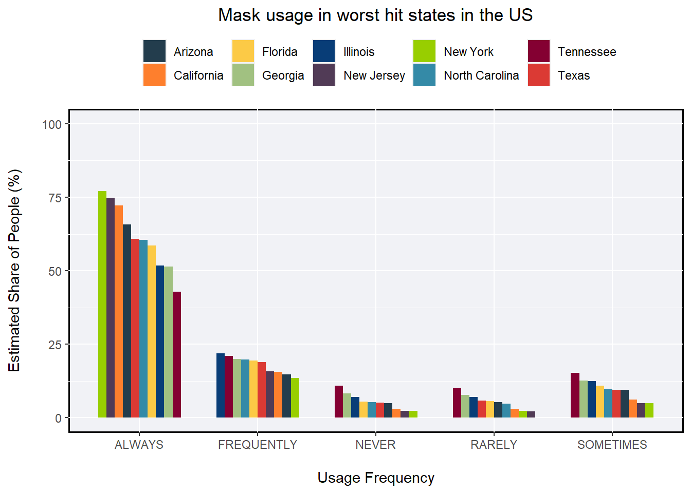
Figure 2: The Bar plot shows frequency of mask usage in the top 10 worst hit states of USA.New York has higher proportion of regular mask usage.
We can see from the figure 2 the proportion of people in each state who wear masks always,frequently, sometimes,rarely and also never.With such high incidence of COVID-19 in these states,it is reasonable to see that the proportion of people who never wear any kind of mask is very low and that the proportion of people who always wear mask is higher.An interesting pattern we can see here is that California being the state with highest number of cases is only third to New York where more than 75% of people wear mask always when they are in near proximity to other people.This could be because the occurence of deaths in New York is higher than that of California.We can also see that in New Jersey being the state with second highest number of deaths comes second to New York in terms of proportion of people wearing masks always. With that being said, Texas with higher rate of deaths has lower proportion of such people compared to California.This pattern can be seen in reverse for all other frequencies. For example, New York has the lowest proportion of people who never wears masks where as Tennessese has the highest proportion. This holds true for every other usage frequency except for “frequently” where we can see that Illinois has higher share of people when compared to Tennessese.
Now that we are seeing patterns in deaths and mask usage in state, let us dive into analyzing the correlation between the incidence of cases and deaths with the frequency of mask usage.
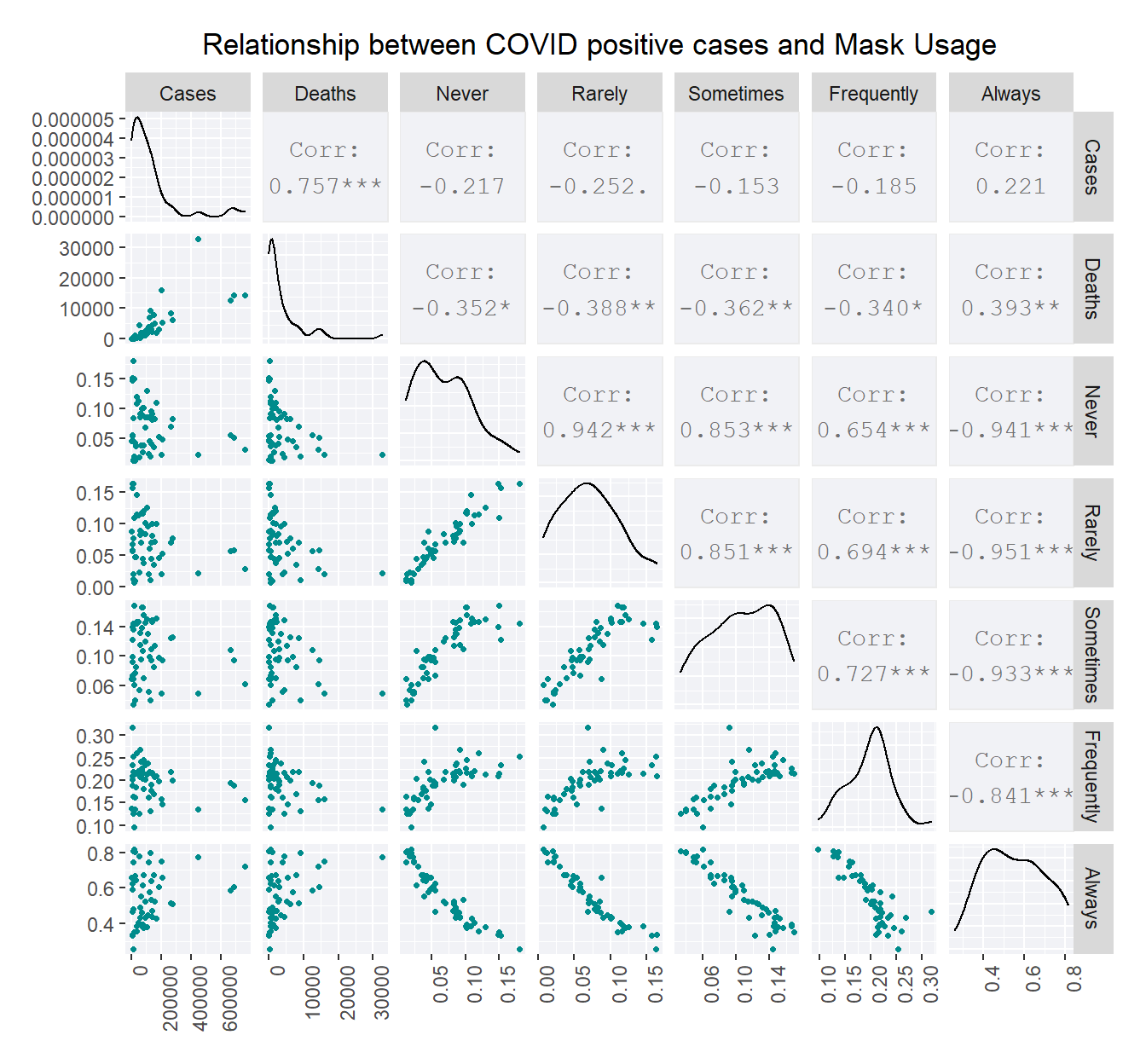
Figure 3: The scatter plot matrix depicts the correlation between the frequency of mask usage and cases as well as deaths.The number of deaths appear to have more influence of the behaviour of mask usage.
As seen in figure 3, Cases and deaths have a positive correlation ,that is with the cases going up, it is likely for the death figures to go up too. It is also evident from the figure that deaths have a positive correlation with the proportion of people who always wear masks and a negative correlation with other frequencies. This can also be seen in case of cases too ,but what is more interesting is that the correlation is more between deaths and frequency ‘always’ than what ‘always’ has with cases. Therefore, it explains the pattern we saw earlier wherein New York has a higher proportion of population who wears masks regularly.
Another interesting point to note is that if there is a large proportion of people not wearing masks then it is also likely that there is a presence of people wearing masks rarely.It can also be seen that if a lot of people wear masks only at times, then it is more likely to see a lot of people not wearing it than seeing people wear it frequently.
Is there a racial disparity in COVID-19 deaths in New York?
Now that we saw the death toll due to COVID-19 is highest in New York,let us analyze if there is any racial disparity in the COVID-19 related deaths. In order to do so,the dataset released by National Center for Health Statistics is taken into consideration and the proportion of deaths with respect to each ethnic group is calculated.The deaths in the dataset is mainly of three types, COVID-19 related, Pnuemonia along with COVID-19 deaths,and deaths categorized as Pneumonia, Influenza, or COVID-19 Deaths.To calculate the proportion, the deaths related to COVID-19 and deaths caused by Pneumonia and COVID-19 are taken into consideration.Since there is a possibility that other category could be caused by something other than COVID-19, it was not taken into account.The major ethnic groups in New York are Non-Hispanic White,Non-Hispanic Black,Non-Hispanic American Indian or Alaska Native,Non-Hispanic Asian and Non-Hispanic Native Hawaiian or Other Pacific Islander and Hispanic.In order to focus more on New York City,one of the most culturally diverse city in the world, two different set of calculations were carried out focusing New York City and rest of New York separately. The calculated proportion of deaths above 0% in New York excluding New York City is shown in figure 4.
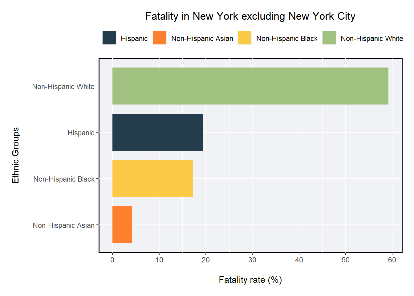
Figure 4: The Bar plot shows the fatality rate in New York excluding New York City. The most affected racial and ethnic group is Non Hispanic White community.
From the figure,it can be observed that around 60% of the deaths in parts of New York other than New York City,is of Non Hispanic White where as the lowest rate is seen in Non Hispanic Asian community with a fatality rate below 5%.The deaths due to COVID in Hispanic and Non Hispanic Black communities are between 15-20% with Hispanic proportion being at the upper end.
With that being said we can see a completely different pattern when we look at the fatality in New York City in figure 5, which is much more diverse than rest of State of New York.The figure shows the fatality rates that is above 0% in New York City. We can see that around 35 % of the deaths are of people of Hispanic origin followed closely by the Non Hispanic Black community with a fatality rate of 30 % and Non Hispanic White with around 25 % fatality. The lowest can be seen again in Non Hispanic Asian community but the fatality is more in New York City when compared to other parts of New York.
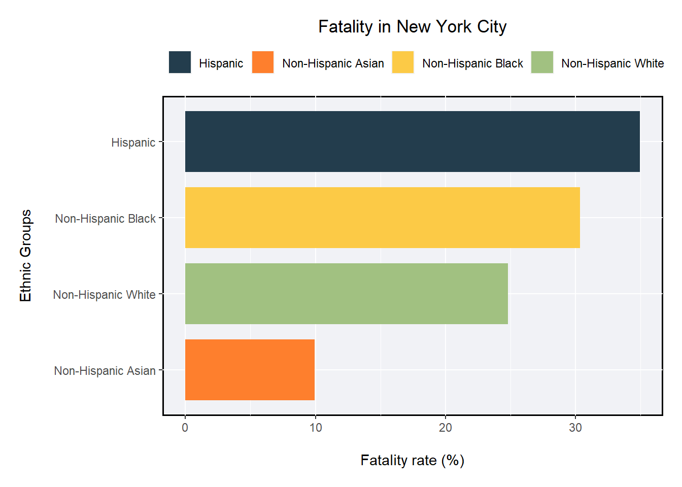
Figure 5: The Bar plot shows the fatality rate in New York city. The most affected racial and ethnic group is Hispanic community.
Through this analysis, it is possible to see that there is a level of racial disparity in deaths due to COVID-19. According to an article published by Mayo Clinic,the area where you live have a major impact on the COVID-19 incidence and deaths as well as the chances of getting treatment. For example, members of low income racial,ethnic minority sections might be living in multi-generational homes, crowded conditions and densely populated areas,like New York City.This could make social distancing difficult to practise. Apart from that,access to health care and racism also have an impact on the health risks during this pandemic.Members of racial and ethnic minorities encounter barriers in getting access to health insurance there by hurting their chances for quality health care. We also saw how cases and deaths relate to the practise of wearing masks in different states of the US and it can be said that more than cases, deaths due to COVID-19 influence people to wear masks.After seeing New York having more deaths than California even though it has higher incidences of COVID-19 cases,we can say that the on-going pandemic hit New York the most in the US.
References
[1] Wickham et al., (2019). Welcome to the tidyverse. Journal of Open Source Software, 4(43), 1686, https://doi.org/10.21105/joss.01686
[2] Nicholas Tierney, Di Cook, Miles McBain and Colin Fay (2020). naniar: Data Structures, Summaries, and Visualisations for Missing Data. R package version 0.5.2. https://CRAN.R-project.org/package=naniar
[3] Hadley Wickham, Jim Hester and Romain Francois (2018). readr: Read Rectangular Text Data. R package version 1.3.1. https://CRAN.R-project.org/package=readr
[4] H. Wickham. ggplot2: Elegant Graphics for Data Analysis. Springer-Verlag New York, 2016.
[5] nytimes/covid-19-data. (2020). Retrieved 12 September 2020, from https://github.com/nytimes/covid-19-data
[6] Deaths involving coronavirus disease 2019. (2020). Retrieved 12 September 2020, from https://data.cdc.gov/NCHS/Deaths-involving-coronavirus-disease-2019-COVID-19/ks3g-spdg
[7] Workbook: NYS-COVID19-Tracker. (2020). Retrieved 18 September 2020, from https://covid19tracker.health.ny.gov/views/NYS-COVID19-Tracker/NYSDOHCOVID-19Tracker-Fatalities?%3Aembed=yes&%3Atoolbar=no&%3Atabs=n
[8] Kyle Walker (2020). tidycensus: Load US Census Boundary and Attribute Data as 'tidyverse' and 'sf'-Ready DataFrames. R package version 0.9.9.5.https://CRAN.R-project.org/package=tidycensus
[9] A Detailed Map of Who Is Wearing Masks in the U.S. (2020). Retrieved 17 September 2020, from https://www.nytimes.com/interactive/2020/07/17/upshot/coronavirus-face-mask-map.html
[10] Morfin, M. (2020). The 10 Most Multicultural Cities in the World. Retrieved 17 September 2020, from https://theculturetrip.com/north-america/usa/california/articles/the-10-most-multicultural-cities-in-the-world/
[11] Why is COVID-19 more severely affecting people of color?. (2020). Retrieved 18 September 2020, from https://www.mayoclinic.org/diseases-conditions/coronavirus/expert-answers/coronavirus-infection-by-race/faq-20488802
[12] Barret Schloerke, Di Cook, Joseph Larmarange, Francois Briatte, Moritz Marbach, Edwin Thoen, Amos Elberg and Jason Crowley (2020).GGally: Extension to 'ggplot2'. R package version 2.0.0.https://CRAN.R-project.org/package=GGally
[13] Yihui Xie, Joe Cheng and Xianying Tan (2020). DT: A Wrapper of the JavaScript Library 'DataTables'. R package version 0.15.https://CRAN.R-project.org/package=DTAarathy Babu
Student
Post-Grad Student| Business Analytics | Monash University | Here to live my life so well that death would tremble to take me.